First Taste of Android Jetpack Compose

After hearing about Android Jetpack Compose in Google IO 2019 this year, I wanted to try it out very much. This week I have to chance to try it out. It looks pretty promising, so I wanted to write a post about my finding.
Since Compose library is still in a very early-stage, there's not much documentation around it. I can only rely on the few resources I can find online, plus the source code that is just made open sourced. So read my post with a grain of salt!
Here are some of the resources including the Google IO video that I can find:
- Declarative UI Patterns (Google I/O'19)
- Android Developers Backstage: Episode 115: Jetpack Compose
- Compose From First Principles
- Diving into Jetpack Compose
What's Android Jetpack Compose?
Previously the entire Android UI Toolkit is build on top of the View class. This is built from long time ago when Android was created. Since it was such a long time ago, there are a lot of design choices that can be improved, but it is hard to improve on them without re-writing them from scratch.
Over the years, there are many new concepts in the client-side world (including Front End development) that have emerged, so Google team decided to do exactly that and re-write the entire UI layer from scratch, and that is the Android Jetpack Compose library. Borrowing the concepts from React, Litho, Vue, Flutter, and more.
Let's go through some of the pitfalls of the existing UI system vs. the new Compose library.
1. Unbundled from Android Platform Releases
The existing UI system is platform dependent. When material design made its first debut, it only works from Android 5 and above. Older versions need to depend on support libraries. However, the Compose library itself is made into a Jetpack component, that means it's a platform independent library to begin with. So it can work independently from the platform version itself.
2. All Kotlin API
Previously we have to deal with various files to make our UI work. We have to rely on xml to describe the layout itself, then use Java/Kotlin code to control the logic. Then there is styling that comes in another xml file, and animation that comes with yet another xml file. The introduction of Kotlin has made it possible to write a declarative UI in a programming language instead of xml.
3. Composable: composition over inheritance
Writing a custom view in the existing UI can be cumbersome. We have to inherit from the View class and take care of many things before it can run properly. The TextView,java has ~30k lines of code. That is because it has to take care of many things inside the class, but Composable library is taking another approach, which makes everything composable.
The example of padding that is mentioned in the podcast is a good example to portray this.
In existing UI system, in order to render a TextView with 30dp padding:
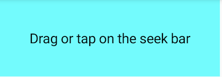
We need to have the following code:
<TextView android:id="@+id/simpleTextView"
    android:layout_width="wrap_content"
    android:layout_height="wrap_content"
    android:background="@color/cyan"
    android:padding="30dp" <------------------------ NOTE THIS
    android:text="Drag or tap on the seek bar" />
This means that somewhere inside the TextView.java or it's parent needs to know know to calculate the padding.
Let's take a look at doing the same thing, but with Compose library:
// note: the cyan background color is omitted for now to keep it simple
Padding(30.dp) {
    Text("Drag or tap on the seek bar")
}
Changes
The TextView has become just Text(). The android:padding property of TextView becomes Padding that wraps around Text instead.
Advantages
This way Text is only responsible for text rendering, it doesn't know how to calculate padding. On the other hand, Padding only handles padding and nothing else, it can be reused to wrap around anything that needs some padding. 👍
4. Unidirectional Data Flow
In the podcast (near 26:00), the team behind Compose library talks about the concept of having a unidirectional data flow. Let's consider a stateful CheckBox in the existing UI system. When the CheckBox is clicked, it's state becomes checked = true, this class itself updates itself and expose a listener to the application to listen to this state change.
So in your application logic code, let's say your ViewModel, you probably need to update your state variable to reflect this. Now that you have 2 copies of this checked state, which is error prone. Also, a change in state variable inside the ViewModel will trigger an update to the CheckBox which may risk an endless loop. Hence we might need a differ to help us in this.
With Compose library, all this will be resolved, since this is one of the design principle! The diffing will be handled by the Compose framework, and the data model can now be fed into the Compose component. Besides, the compose component now doesn't change it's own state by itself, but instead, it only exposes the listener, and it's the application's responsibility to update the state.
5. Better debugging
Since this is built using all Kotlin code, debugger and breakpoint will work! This is mention somewhere in the podcast. I haven't tried it myself though.
Show Me Some Code!
I know you wanted to see some code, let's do it!
We'll begin by making a few simple views, then we can compare how it looks like using existing UI Views vs. Compose library.
1. FrameLayout vs Wrap, Padding & Background
Let's reuse our example from above, and try to make this TextView with 30dp padding and cyan background:
Existing UI views:
<TextView android:id="@+id/simpleTextView"
    android:layout_width="wrap_content"
    android:layout_height="wrap_content"
    android:background="@color/cyan" <-------------- NOTE THIS
    android:padding="30dp" <------------------------ AND THIS
    android:text="Drag or tap on the seek bar" />
Now let's look at the code to achieve the same thing using Compose library:
@Composable
fun MyText() {
    Wrap {
        Padding(30.dp) {
            DrawRectangle(color = Color.Cyan)
            Text("Drag or tap on the seek bar")
        }
    }
}
There are a few new things happening here. Since Text only knows about rendering text, it doesn't care about padding nor background. So in order to add them, we need to use 2 other separate functions to achieve it:
-
DrawRectangledraws thebackground -
Paddingtakes care of thepadding -
Wrapis a function that takes children and stack them together, quite similar to the concept ofFrameLayoutto me
Not too hard! But certainly feels different from the existing UI View system that I am used to... 💭
2a. Vertical LinearLayout vs Column
Now let's take a look at how to make something equivalent to our good old LinearLayout using Compose.
To stack 2 buttons together like below, we can use Column:
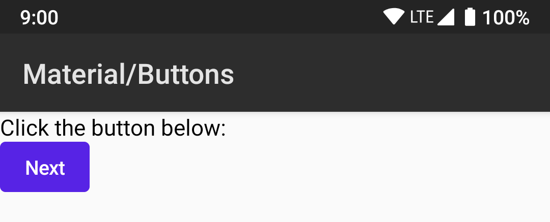
The code looks like this:
@Composable
fun FormDemo() {
   Column(crossAxisAlignment = CrossAxisAlignment.Start) {
      Text("Click the button below: ")
      Button(text = "Next")
   }
}
The children inside Column will be stacked together vertically.
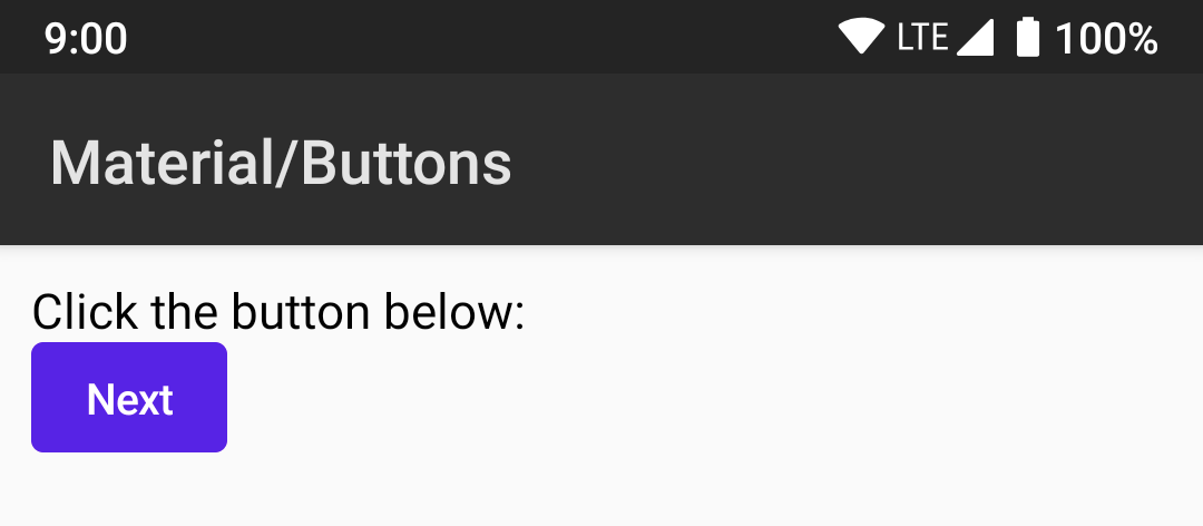
2b. Padding
You probably noticed that the text and button are too close to the edge. Let's add some Padding.
@Composable
fun FormDemo() {
+    Padding(10.dp) {
        Column(crossAxisAlignment = CrossAxisAlignment.Start) {
            Text("Click the button below: ")
            Button(text = "Next")
        }
+    }
}
After wrapping with Padding, it looks better now:
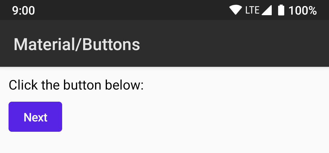
2c. Spacing
To further improve the look, we can also add some space in between the Text and the Button:
@Composable
fun FormDemo() {
    Padding(10.dp) {
        Column(crossAxisAlignment = CrossAxisAlignment.Start) {
            Text("Click the button below: ")
+           HeightSpacer(10.dp)
            Button(text = "Next")
        }
    }
}
Here's the look with HeightSpacer:
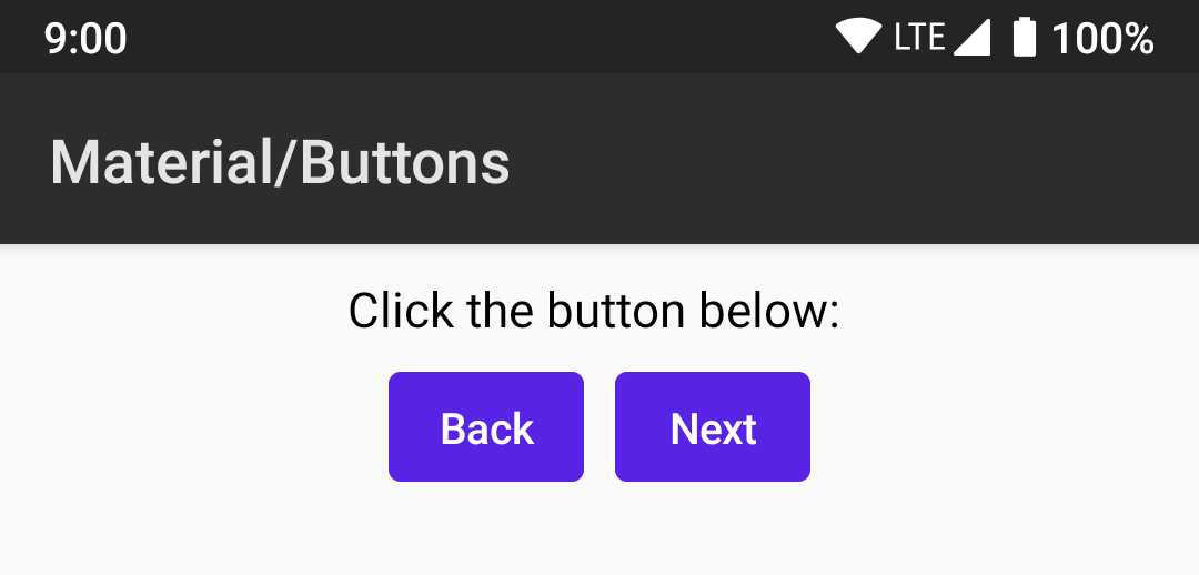
2d. Horizontal LinearLayout vs Row
Next, let's take a look at how to stack another button like below:
Here's the code for it:
@Composable
fun FormDemo() {
    Padding(10.dp) {
        Column(crossAxisAlignment = CrossAxisAlignment.Start) {
            Text("Click the button below: ")
            HeightSpacer(10.dp)
+           Row {
+               Button(text = "Back")
+               WidthSpacer(10.dp)
                Button(text = "Next")
+           }
        }
    }
}
By adding Row, the 2 Buttons inside will be stacked horizontally. WidthSpacer will keep them from staying too near to each other.
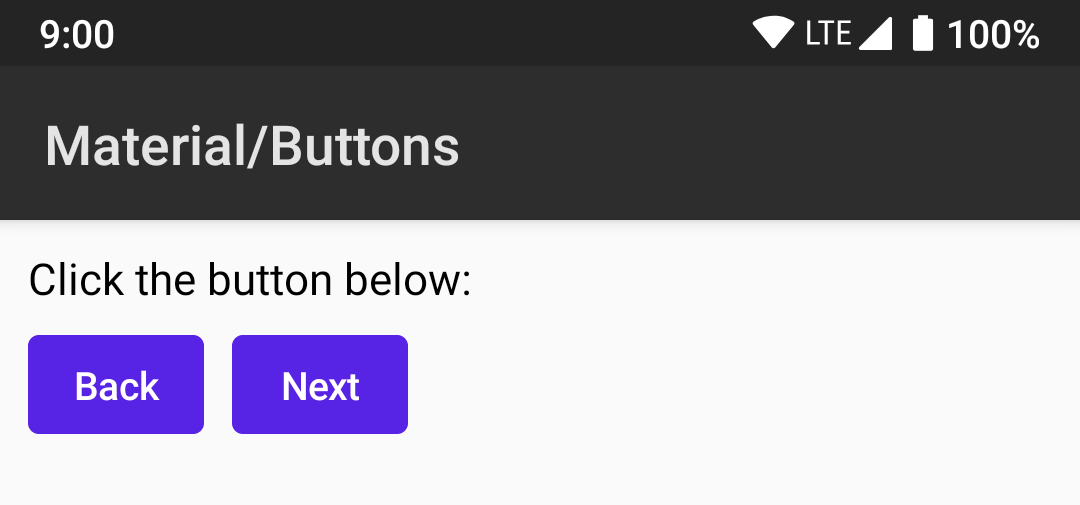
2e. Gravity vs Alignment
Now let's try to make it float towards the center, this is like gravity in our existing view system. Here's the code diff:
@Composable
fun FormDemo() {
    Padding(10.dp) {
-        Column(crossAxisAlignment = CrossAxisAlignment.Start) {
+        Column(crossAxisAlignment = CrossAxisAlignment.Center) {
            Text("Click the button below: ")
            HeightSpacer(10.dp)
-            Row {
+            Row(mainAxisSize = FlexSize.Min) {
                Button(text = "Back")
                WidthSpacer(10.dp)
                Button(text = "Next")
            }
        }
    }
}
This will produce:
With crossAxisAlignment set to CrossAxisAlignment.Center, the children will be center align horizontally. The Row has to be set to mainAxisSize = FlexSize.Min similar to wrap_content so that it can floats in the center, because the default sets it to mainAxisSize = FlexSize.Max which acts like match_parent.
2f. Observation
From what we see from the few examples above, it can be seen that the views are composable, padding is a separate function, spacer is a separate funtion instead of being a property inside Text, Button or Column.
The more complex views like RecyclerView or ConstraintLayout are still under development and I couldn't find example for them inside the demo source code.
3. Styling
You probably notice that the buttons above are blue in color and wonder how come, let's talk about styling a little bit.
In the above example, I'm showing FormDemo with @Composable annotation, here's how to set it as the main view:
override fun onCreate(savedInstanceState: Bundle?) {
    super.onCreate(savedInstanceState)
    setContent {
        CraneWrapper{
            MaterialTheme {
                FormDemo()
            }
        }
    }
}
Instead of setContentView(), we use setContent(), it's an extension function from Compose.kt library.
CraneWrapper holds the compose tree and gives access to Context, Density, FocusManager and TextInputService. ( I learned this from kotlinlang slack).
MaterialTheme let's you customize the theme of the views.
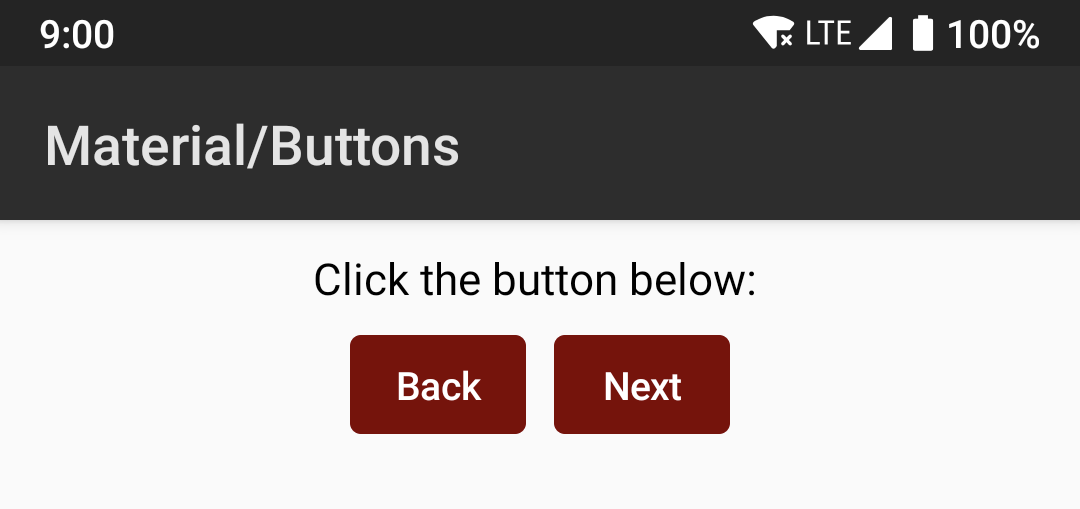
For example, I can change the primary theme color to Maroon by doing this:
override fun onCreate(savedInstanceState: Bundle?) {
    super.onCreate(savedInstanceState)
    setContent {
        CraneWrapper{
-            MaterialTheme {
+            MaterialTheme(colors = MaterialColors(primary = Color.Maroon)) {
                FormDemo()
            }
        }
    }
}
It will look like this:
There are other color and typography choices you can customize:
MaterialTheme.kt#57
The Rally Activity has a good example of how to customize the theme further:
source code to RallyTheme.kt
Resources
If you are interested, you can compile the example project following the instruction here:
How to get the source code
As of this writing Windows users, there's no official way to run Compose yet, but I saw an unofficial guide teaching you how to run it on Windows in kotlinlang Slack: https://medium.com/@Alex.v/running-jetpack-compose-on-windows-10-954738828f0b
For questions about compose, the development team behind it can be reached out through kotlinlang Slack inside #compose channel.
Closing
The development of this library is still under heavy development so all the things shown in this post might be changed. There are still many things to explore in available source code, such as the @Model and unidirectional data flow feature which I'm very interested in, but this post is getting pretty long, I will explore that in another blogpost next time.
See you next time! 👋
Tan Jun Rong
Clap to support the author, help others find it, and make your opinion count.